
SoraRabbit Short Hop 035: That Time SoraRabbit Read More Liefeld Comics Part 5
We’ve made it to the end of our long, arduous journey through some of Rob Liefeld’s lazy art from the 90s… and beyond! As explained in greater detail in earlier posts, I’m dong this as a way of coping with forcing myself to read Liefeld’s New Mutants and X-Force issues as a part of my quest to read every X-Men related comic. Here are the previous entries in this series:
SoraRabbit Short Hop 011: That Time SoraRabbit Read More X-Comics
SoraRabbit Short Hop 024: That Time SoraRabbit Read More Liefeld Comics Part 1
SoraRabbit Short Hop 028: That Time SoraRabbit Read More Liefeld Comics Part 2
SoraRabbit Short Hop 030: That Time SoraRabbit Read More Liefeld Comics Part 3
SoraRabbit Short Hop 032: That Time SoraRabbit Read More Liefeld Comics Part 4
Now, as mentioned last time, with this entry I have finally reached the end of this long and difficult task. Liefeld continued plotting duties through X-Force issue 11, but he stopped art duties as of issue 9. That said, he barely arted any of issue 8, most of it going to a guest penciller. There were panels I wanted to discuss on these last two issues, but that wouldn’t have been enough content, so I did something that I instantly regretted and will regret for the rest of my life. I skimmed Youngblood #1 and thumbed through the next 7 issues. Of my own free will. Using some of the precious time remaining to me on this plane of existence. I did this and suffered through it for you, my wonderful and appreciated readers.
And now that I assume you’ve all given me the sympathy I desperately needed, let’s wrap this up!
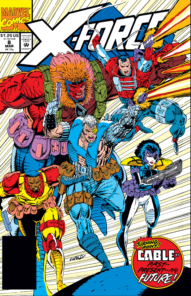
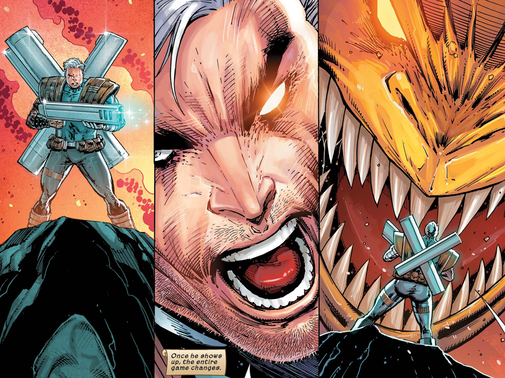
Action-packed cover! (Credit: Rob Liefeld, Marvel)
Taken From: X-Force #8, cover date March 1992. Writer: Fabian Nicieza. Art and Plot: Rob Liefeld.
Context: Zoooooom!
Thoughts: Everyone has pouches this time! Look at those motion lines! Also note that they’re not all motioning the same direction. Oops. This drawing features one of the 90’s art shortcuts— extra laser blasts to show the gun is being moved quickly. But here the extra gun shots look like they’re coming out of the big guy’s fist. I’ve never understood Domino’s headpiece… is it supposed to protect her forehead and cheeks? How does it stay on? It looks like it would be uncomfortable. I’d feel like I was constantly looking through that hole in a chiropractor’s table.
And let’s get back to our favorite game: speculating what’s in the pouches. This time we’ll look at the big guy, I think his name is Grizzly? I’m gonna say energy drinks and granola bars. Being that big, you have to keep fueling yourself on these exciting mercenary missions or you’ll collapse under your own weight. One pouch has a teddy bear for when he goes nappy-time.

A pin-up. (Credit: Rob Liefeld, Marvel)
Taken From: X-Force #8, cover date March 1992. Writer: Fabian Nicieza. Art and Plot: Rob Liefeld.
Context: Is Cable.
Thoughts: So many extra lines. His gun is weirdly flat and tucked into his arm weird. It also has two clips for some reason. As usual the knife is cocked wrong and the bottom of the handle is not showing. The worst part of this is the random junk sticking up from his back. What the hell are those? Rocket launchers? Missiles? Jet skis? Also, a small detail I just noticed is that he’s standing in front of Gideon’s headstone. Gideon is still alive at this point, and also a freaking immortal. So I have no idea what that means. Weird.

Another pin-up. (Credit: Rob Liefeld, Marvel)
Taken From: X-Force #8, cover date March 1992. Writer: Fabian Nicieza. Art and Plot: Rob Liefeld.
Context: Is also Cable.
Thoughts: I mainly just included this because I thought the way he’s standing is hilarious. And look at his little knife! It’s cute. Is one side sharp and the other jagged? Not sure. I don’t know what that weird shadow is on the wall behind him. Rob showed an uncharacteristic amount of restraint in that handgun, making it way more reasonably-sized. But still, random crap on his back.

A tender moment. (Credit: Rob Liefeld, Fabian Nicieza, Marvel)
Taken From: X-Force #9, cover date April 1992. Writer: Fabian Nicieza. Art and Plot: Rob Liefeld.
Context: Sam is dead. But don’t worry, he’ll live.
Thoughts: There’s something weirdly dainty about how Sam’s corpse is laying in Cable’s arms. And I love how the only parts in shadow are Sam’s face and the lower part of Cable’s leg while Cable’s face is fully lit. That’s how shadows work, right? They just effect some people? Right?
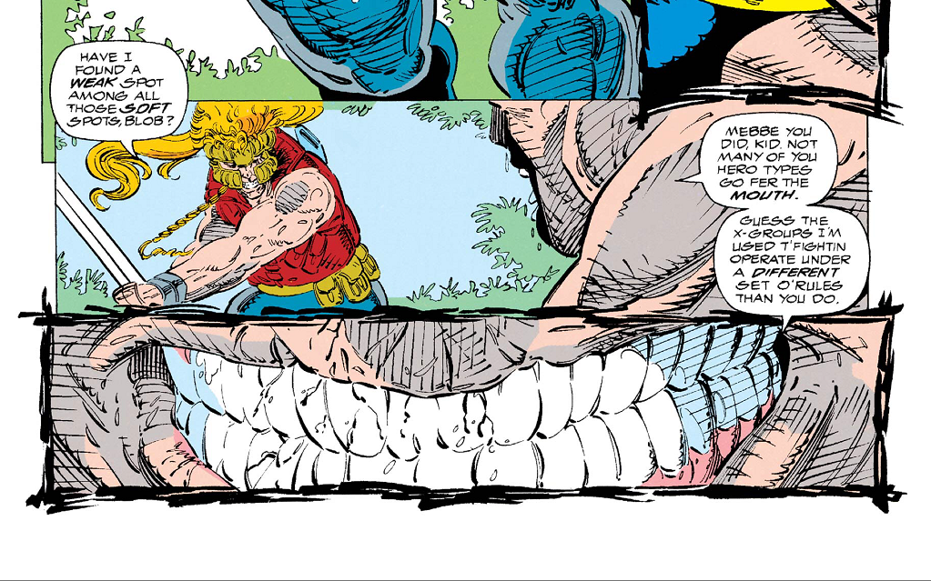
So tired of Blob’s teef. (Credit: Rob Liefeld, Fabian Nicieza, Marvel)
Taken From: X-Force #9, cover date April 1992. Writer: Fabian Nicieza. Art and Plot: Rob Liefeld.
Context: Blob talks about mouth stuff. Eww.
Thoughts: Hey, teefs again. 18 on the top, 20 on the bottom. That’s normal. I have no idea why we’re zoomed in so far on his grin. Not much else to say about these panels, but check out that wonky sword.

That’s a whole lotta guy. (Credit: Rob Liefeld, Fabian Nicieza, Marvel)
Taken From: X-Force #9, cover date April 1992. Writer: Fabian Nicieza. Art and Plot: Rob Liefeld.
Context: I, uh, I think his name is Biggun McBigstuffs? I could be wrong. I’ve read a lot of comics lately.
Thoughts: I had to include a drawing with a lot of unnecessary cross-hatching. And a blurred foot. I’ve never understood how Forearm’s arms work. They’re too close together. None of his arms should have the full range of motion. How can you have an upper shoulder and a lower shoulder? Think about it. There’s also something strange about how his right leg is bent. The one thing I can say about this is that I’m shocked that the sumo guy has no pouches. You’d think he’d have a pouch-covered belt or pouches sewn into his diaper. Missed opportunity. (If he’d had pouches, they’d be filled with extra safety pins and baby powder, obviously. Several pounds of baby powder.)
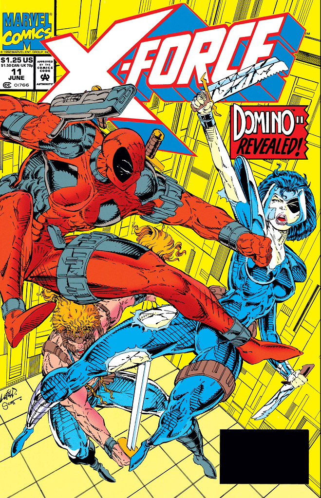
The last cover. (Credit: Rob Liefeld, Marvel)
Taken From: X-Force #11, cover date June 1992. Writer: Fabian Nicieza. Cover Art: Rob Liefeld.
Context: Domino… revealed? I guess? Oh! Because her costume is torn! I get it now.
Thoughts: Just the cover this time. I’m assuming he did this cover ahead of quitting Marvel. Why is Domino’s costume torn with cut marks on her legs if Deadpool is holding a gun? Did she cut her own leg with her… I guess you’d call it a “double-knife”? If you look at the other double-knife in her left hand, part of the hilt is missing and her finger is pressing against the blades. Ouch. Why were there so many double-knives and double-swords in Rob’s art? Because two blades is better than one blades.
If you look at Deadpool’s sword on his back, you’ll see what I was complaining about in last post’s bonus panels. No blade is visible when it should be. Spatial awareness is hard. Before we go, just look at the composition. It’s a very top-heavy drawing. Did Shatterstar really need to be crammed in there near the bottom? It makes the cover look so much messier than it needs to be. Also he looks like he’s stabbing her in the thigh. This cover is an unattractive jumble of flailing limbs.
And as a side note, I’m sure Domino’s pouches have extra costumes since hers are constantly getting ripped up in provocative ways.

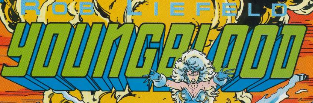
It’s his “O” face. (Credit: Rob Liefeld, Image)
Taken From: Youngblood #1, cover date April 1992. Writer and Art: Rob Liefeld.
Context: We’ve arrived at Rob’s “original” comic for Image— Youngblood. (See post 3 for more Youngblood crap.) I only got two panels from the first issue, and they weren’t all that interesting, but I decided to include them anyway.
Thoughts: I’m gonna be honest with you. I didn’t read all of this issue. I mainly just looked at the pictures. The horrible, horrible pictures. Not even horrible in a way I could comment on. Just… boring and repetative. All stuff I’ve already pointed out. What I did read of the story wasn’t great either. But we’re not here for the story. For my first screenshot, I chose a simple one. The rest of the panel doesn’t matter. I just had to share this guy’s hole mouth. Get it? Whole mouth? Hahahakillme.

What are they looking at? (Credit: Rob Liefeld, Image)
Taken From: Youngblood #1, cover date April 1992. Writer and Art: Rob Liefeld.
Context: Youngblood assemble! Er, gather. Congregate?
Thoughts: The first issue of Youngblood introduces Hawkeye, Deadpool, Domino, Cable, Stryfe, G.W. Bridge, Sabretooth, Juggernaut, the Thing… no wait, Rob doesn’t have the rights to any of those characters. So that means these are completely original characters with no similarities to any other characters, right? Right?
I honestly don’t have anything new to say about the art. I just wanted to point out that they’re all lined up and facing one direction, which is not towards the monitor they should be looking at for their briefing. And I know I said I wasn’t going to talk about the writing but I actually have a compliment this time. “What’s eatin’ Shaft today?” Perfect line, no notes.
Cable has junk in the trunk as well as the pouches. (Credit: Rob Liefeld, Marvel)
Taken From: Deadpool Team-up #5, cover date February 2025. Writer and Art: Rob Liefeld.
Context: Bonus panel 1 of 2. Some shots of Cable.
Thoughts: What’s eatin’ Cable? Bwahahaha!
Okay, enough of that. I’m just here to say WTF? What is that strapped to his back in the first panel. Guns? Cannons? Components for a water slide? I know it’s meant to be clever that it’s in the shape of an X but it just looks silly. And I have no idea how they’re connected to his back and to each other. All I can think of is that maybe Cable’s back is magnetic and he can stick whatever he wants back there. Also, I have to mention that Cable’s bulge and booty are lovingly detailed. Hey, as long as his metal arm is on the right side, lovingly detail whatever you want, bro.
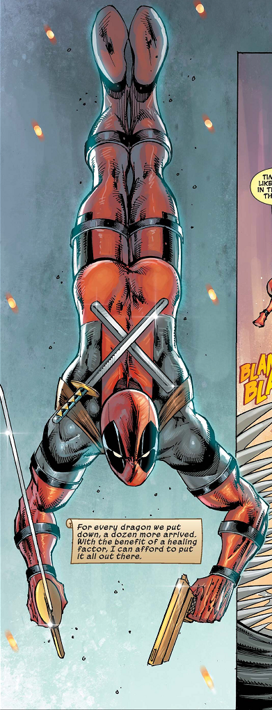
Deadpool takes a dive! (Credit: Rob Liefeld, Marvel)
Taken From: Deadpool Team-up #5, cover date February 2025. Writer and Art: Rob Liefeld.
Context: Bonus panel 2 of 2. I couldn’t decide, so you get both. And please keep in mind these panels are NOT from thirty years ago. They’re from 2025.
Thoughts: So much to unpack here. The least of it is that lovingly rendered image of Deadpool’s dumper. So many images of firm male buttocks. Not that there’s anything wrong with that. But his buns just stand out so strangely amid the rest of him. I’m sorry, but butts don’t work like that. The strangest thing has to be his feet though. Feet don’t bend that way. Or, at least they weren’t designed to bend that way. Heads either, for that matter.
Once again the hilt, handle, and blade of the sword are at drastically wrong angles. The belt of pouches he’s wearing before and after this panel is mysteriously gone. Did he remove it so that he could dive more easily? Continuity is hard. Oh! Maybe he put it into another pouch! This changes everything. It took us six posts but we’ve finally solved the age-old question of what’s in the pouches. More. Freaking. Pouches. It’s pouches all the way down. Pouchception! Bam.
But still, the part that amuses me the most are the sheaths on his back. They’re soooo short! One of them still has a sword in it and the length is way off compared to the other sword in his hand. No way could it fit in that empty sheath. And, again, they must be velcroed on there because the straps don’t reach the sheaths. There’s no way they could be fixed on his back like that unless they’re sewn into the costume. And if that’s the case, why do they mysteriously vanish sometimes?
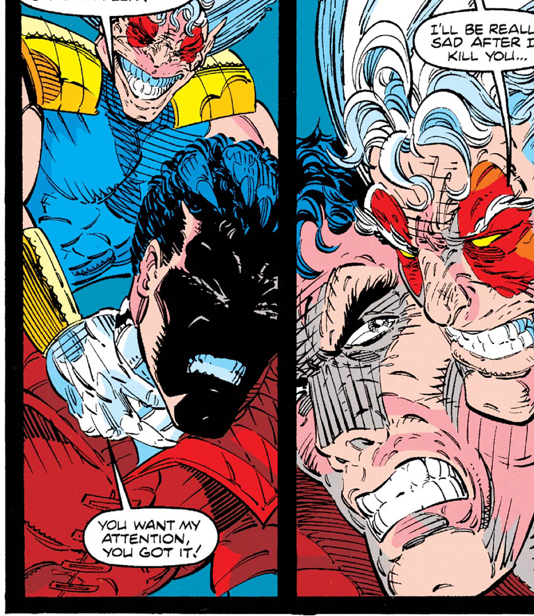
You ever been choked so hard your face becomes shadows? (Credit: Rob Liefeld, Marvel)
Okay. I’ve talked enough about the art in these six posts. You all get the point. Let’s talk for a minute about his plots. He didn’t script any of the 90s stuff. For those who don’t know, there is a difference between the plot and script. The plot is basically a rough outline saying “this is what needs to happen in the issue”. This gets handed to the scripter who does what they can to make a coherent and fleshed out story from a paragraph or two. I don’t know what’s plot and what was script, so it wasn’t fair to comment on it unless I found something glaring and nit-picky to bring up.
He did, however, script Deadpool Team-Up. Supposedly his final ever Deadpool comic. (We’ll see.) It was some nonsense about travelling through time to save dragon eggs and stop an army of dragon-human hybrids. But mostly it was an indulgent excuse for Deadpool to fight a different character every issue and then team up with them to go after dragon-guys. And then that thing where the writer puts himself into the story, which can be awesome handled properly. If done sloppily, it is the pinnacle of hack writing. Guess how it was done here?
SIGH. (Credit: Rob Liefeld, Marvel)
Yeah. Everyone thinks they’re Vonnegut. Meh. Christopher Priest did it first, and Deadpool even killed him in the comic.
I just want to conclude all this mess with a massive disclaimer. None of this is meant to insult fans of Liefeld’s work. I am a firm believer that you should celebrate the things you love and just because I don’t have a taste for something absolutely does not mean it’s without value. I want you all to treat these posts as what they were intended to be— a bit of self-indulgent fun, amusing myself and hopefully you all as well. No actual hate to Rob Liefeld was meant, regardless of how I came across at times. He clearly enjoys what he does, and (I can only assume) does it to the best of his abilities. (Anything else I could say would be speculation and opinion.) That’s all any of us can do… our best.
Not all of it was bad. You know I cherry picked these examples. There were plenty of panels that were okay. Or at least tolerable. I only showed you the art I could comment on and make jokes about. (I discarded a lot of screenshots because I would have just been rehashing.) I know I’ve been overly critical in this series of posts, and at times, downright mean. But you know that’s not me. This was all done in fun. Fun mixed with annoyance that someone with such questionable talent could possibly make so much money and be so acclaimed over three decades without having a real reckoning. It irks me, and I’m not a bunny who’s easily irked. But hey, we all need mortal enemies, right? Enemies bring out the best in us and make us strive to be better, to overcome. My mortal enemies are Rob Liefeld and Sally Struthers. (Never mind why.)
So yeah, I felt the need to really drill down and pick this art apart. I don’t typically do that. Sure, sometimes I’ll notice these sorts of things in other artist’s work, but I’ll mentally note it, sometimes chuckle, and move on. I want to stress that part… I do not look at art critically in any other case. In that way this series was also an exercise for me, working on my critical skills. Normally I just appreciate art for what it is. I respect that artists can do something I can’t. As I’ve said before, the best I can manage is anthropomorphic animals and stick figures. So I’m no expert. Far from it.
I do know what I like, though. Sam Kieth, Mark Bagley, Greg Capullo, John Romita (both Jr and original recipe), Gurihiru… Steve Ditko and Jack Kirby if you want to go old school… the list goes on and on, and that’s without getting into manga. And yes, there are artists I don’t care for. (Looking at you Mr. Ramos…) But this level of negativity and snark is something you likely won’t see from me ever again. This was a special occasion, I’ve made my points, and I think we can all agree we can never let the 90s happen again, at least in comic book form.
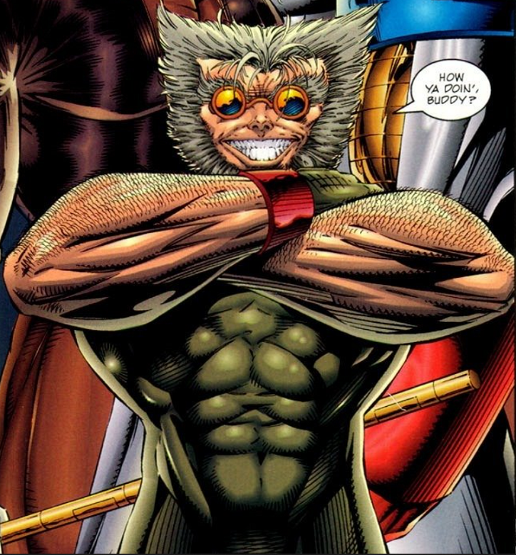
Yeah, baby Wolverine. (Credit: Rob Liefeld, Image)
Now that I’m on the other side of the Liefeld stuff, and I’m deeply entrenched in the 1995 X-Men comics, I can admit that I’m actually enjoying it all a lot more than I expected. From what I remembered and from what I’d heard, I thought that the 90s would be a slog to get through, but it’s actually been pretty fun. Over the top, exaggerated, commercial and more than a bit silly, but entertaining. Thanks to these posts, I was even entertained by Liefeld’s work. (Not in the way it was intended, but I’ll take what I can get.)
Anyway, thank you all for bearing with me as I pursued my personal vendetta, got through the rough patch in my X-Men reading, and had a bit of fun at the expense of… wait… this can’t be right. *checks research again* Ahem. At the expense of a multimillionaire. Sigh. Okay now I feel bad for my disclaimer.
Bleh. As I was saying, thank you for reading these posts and hopefully laughing along with me. After this, we’ll move along to more positive fare. Until then, know that I appreciate you… even if you happen to be poorly drawn with unnatural shading and little to no spatial awareness. I also appreciate handy pouches and lovingly rendered buttocks. See, we’ve all learned something here.

KRAKT. (Credit: Rob Liefeld, Marvel)

