

SoraRabbit Short Hop 032: That Time SoraRabbit Read More Liefeld Comics Part 4
Here we are, continuing our adventures in bad 90s comic book art with Rob Liefeld! I’m not going to go through my reasons again, just know that I’m reading all the X-comics and I wanted help getting through Rob Liefeld’s stuff. I got especially heated last time, so I’m going to try to keep things lighter this time around and not get too upset. Here are the previous entries in this series:
SoraRabbit Short Hop 011: That Time SoraRabbit Read More X-Comics
SoraRabbit Short Hop 024: That Time SoraRabbit Read More Liefeld Comics Part 1
SoraRabbit Short Hop 028: That Time SoraRabbit Read More Liefeld Comics Part 2
SoraRabbit Short Hop 030: That Time SoraRabbit Read More Liefeld Comics Part 3

Why did people think sideways covers were a good idea? (Credit: Marvel Comics. Art: Rob Liefeld.)
Taken From: X-Force #4, cover date November 1991. Writer: Fabian Nicieza. Art and Plot: Rob Liefeld.
Context: X-Force and special guest-star Spider-Man face off against Black Tom Cassidy and Juggernaut.
Thoughts: All I’m sharing from this issue was the cover. The issue itself was pretty boring, just a fight between everyone and Juggernaut, with the bad guys teleporting away at the end. Spider-Man served absolutely no purpose except to web up Juggy’s face and the big guy immediately ripped off the webbing. One interesting thing about this is that the premise is, to quote the issue: “Terrorists… have blown up one of the twin towers of the World Trade Center.“ Yeahhhh… that aged well.
Anyway, on to the art. Spidey is… passable. Too many lines but he’s not grotesque. Cable’s armor is ridiculously bulky and elaborate. And no helmet? What’s to stop his enemies from just aiming for his head? I think the main purpose of the armor is so that Rob doesn’t have to waste precious seconds remembering which arm is supposed to be metal. His gun is silly and way too long. What would the kick-back be on something like that? Also look at his left arm. It would have to be way longer than his right arm to bend round the gun that way. Sure, it’s techo-organic, so maybe he extended it. But still, it looks ridiculous.
It was a trope at the time to have large portions of the comic’s title covered up with the art. Here it just looks like they’re shoving the title away, like it’s crowding them and they need more room to fight and look badass. And, of course, we have to mention the obvious. Sideways covers are awkward and ugly. And also pretty inconvenient on devices that automatically flip the screen when you turn them to the side. The majority of this issue (and Part 1 of the “X-Over” in Spider-Man #16) had the pages flipped so that they were long-ways. It was a strange choice. But at least it made the issues go faster!

Without the dialogue this is a totally different scene. (Credit: Marvel Comics. Writer: Fabian Nicieza. Art: Rob Liefeld.)
Taken From: X-Force #5, cover date December 1991. Writer: Fabian Nicieza. Art and Plot: Rob Liefeld.
Context: Siryn joins X-Force so Rob can draw more bewbs. The team now has eight boobies. Or four women, I guess you could say. (If you wanna look at it that way.)
Thoughts: Remember the last few posts where I spent way too much time bitching that Rob couldn’t remember which of Cable’s arms was metal? (Left, by the way. It always should be left and never right although Rob often swapped them. Sometimes from one panel to the next.) Well, I didn’t realize how professional he was being by simply forgetting a core detail of the character he co-created. No, as you can see in the above panel it could have been worse. And it was! Here (and for the rest of the issue) he completely forgot that Cable even had a metal arm at all. Or he was just too lazy to draw it. It could be either option, honestly. Or both.
I’ll be fair here… later it’s revealed that when he concentrates, Cable can make his arm appear to be made of flesh. This was not referenced here, and was not actually introduced as a possibility until three years later, so I seriously doubt that’s what’s going on here. But if you’re looking for a No-Prize, there’s a possible explanation.
Other than that glaring mistake (or indication of laziness, depending on which camp you fall into) this is just an ugly couple of panels. Cable seems to be able to change his body mass at will. (He’s rarely the same size from one panel to the next.) Those crotch lines look pretty suspect. What’s with all the extra cross-hatching on his neck, chest, and arms? It makes it look like parts of him are oiled. And what is with Siryn’s pose? She looks like she’s fending off Cable’s advances here., not accepting an invitation to join the team.
Also, as for the dialogue… Siryn’s experience? From what I recall from her first appearances in Uncanny X-Men in the 80’s, she was a teenager trying to reconnect with her estranged father and fought in no actual battles. I guess she was in the Fallen Angels miniseries, but that barely counts. She’s been a hero for, like, five minutes. But that’s got nothing to do with anything. It just confused me when he referred to her like she was a seasoned combat veteran.

Shatty-Buns? Is that how she flirts? (Credit: Marvel Comics. Writer: Fabian Nicieza. Art: Rob Liefeld.)
Taken From: X-Force #5, cover date December 1991. Writer: Fabian Nicieza. Art and Plot: Rob Liefeld.
Context: Sex. The context is sex.
Thoughts: Never mind the amazingly boxy hair… I think that’s what happens when you constantly wear whatever that half-hat is that he wears. Rob forgot to draw the star that’s supposed to be over his left eye. (I think it’s either part of his skin or a tattoo. It’s always there other than when Rob forgets about it.) Also, where’d Feral’s tail go? Since she can apparently make it as long as she wants, can she also retract it? This is just plain laziness. Rob’s policy seems to be, if you don’t feel like drawing it, leave it out. Or mask it in shadows or cross-hatching.
After this, there’s a running thing where characters call Shatterstar “Shatty”. It’s dumb. Also, please note that a few issues later we learn that Feral is seventeen. Just, you know, throwing that out there. For no real reason. Just felt it needed to be pointed out.

Fantastic. (Credit: Marvel Comics. Writer: Fabian Nicieza. Art: Rob Liefeld.)
Taken From: X-Force #5, cover date December 1991. Writer: Fabian Nicieza. Art and Plot: Rob Liefeld.
Context: I dunno, I honestly don’t feel like rereading all that dialog. The pictures just made me laugh, so here they are.
Thoughts: Why does everyone have to have hollow cheeks? They all look emaciated. I guess they don’t have time to eat with all the training and being outlaws they’re doing. (How many calories does snarky dialog burn?) You can’t see it well here, but Cable still has his flesh-arm. I also think it’s pretty funny how similar Boom-Boom and Sam’s hair are to each other. Look at how they’re standing in the next to last panel. That shocked stance is just silly. Rob poses his characters like action figures and it always cracks me up.
The worst part, though, is Boom-Boom’s feet. Rob got lazy near the end of the drawing and just drew shapeless blobs with cross-hatching. I knew he hated to draw feet, but this is ridiculous.
Okay, no, I take it back. The worst part is her left leg is on backwards. Look at it, that’s clearly the back of her knee and her calf muscle.

How much you think Blob spends on toothpaste? (Credit: Marvel Comics. Writer: Fabian Nicieza. Art: Rob Liefeld.)
Taken From: X-Force #6, cover date January 1992. Writer: Fabian Nicieza. Art and Plot: Rob Liefeld. (Note the cover date actually shows April, wonder who goofed that one up?)
Context: I don’t actually remember what… hey, more of Blob’s teefs. What were we talking about again?
Thoughts: There’s a lot going on here, but it’s all stuff we’ve seen before. Too many teeth, too many lines. Someone wearing a hood and so of course his face is entirely black. And what is up with the shadows on Blob’s face? What kind of light source would cause just the front of his face, his nose, and his man-boobs to be concealed in shadows?
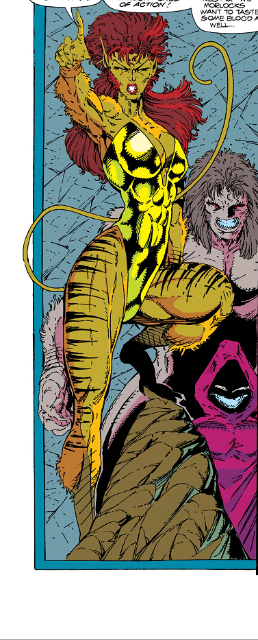
Mrow? (Credit: Marvel Comics. Writer: Fabian Nicieza. Art: Rob Liefeld.)
Taken From: X-Force #6, cover date January 1992. Writer: Fabian Nicieza. Art and Plot: Rob Liefeld.
Context: Yeah, we needed another kitty lady.
Thoughts: Hey, the hood guy is back. Again, I left a bunch of white space in this shot to show how little Rob actually draws. There’s another kitty girl, which I’m starting to think is a fetish. This kitty girl’s name is Thornn and it turns out she’s Feral’s sister. I don’t know why they both got cat-related mutant powers, but whatever. Her tail is ridiculous. It was obviously drawn in after the fact and doesn’t look like it matches the rest of her. One foot is obscured by the rock and the other is covered in shadow. You’d think more of her would be in shadow like the… oh my god I just noticed the dude behind the hood guy. I think he’s nekkid. I take it back. Thank you for the shadows, Rob. They don’t act like real shadows, but they’re covering sewer-guy crotch.

Is punchin’. (Credit: Marvel Comics. Writer: Fabian Nicieza. Art: Rob Liefeld.)
Taken From: X-Force #6, cover date January 1992. Writer: Fabian Nicieza. Art and Plot: Rob Liefeld.
Context: KERAK!
Thoughts: Shatterstar appears to be completely folded in half. Maybe genetically-enhanced alien clones can do that? Even without a shirt he needs more pouches… so suspenders with pouches built in? Can you think of a more 90s fashion statement? You know, aside from enormous shoulder pads, piecemeal armor, unnecessary headsets, and metal appendages. Wow, the 90s was weird.

Fighting a dino-man-guy. (Credit: Marvel Comics. Writer: Fabian Nicieza. Art: Rob Liefeld.)
Taken From: X-Force #7, cover date February 1992. Writer: Fabian Nicieza. Art and Plot: Rob Liefeld.
Context: This was an entire two page spread of the issue. Just wanted to point that out.
Thoughts: Look at Shatterstar’s tiny lil’ feets! Neither of his blades have hilts or points. They’re like rounded sticks. If you look back at the previous screenshot, his hair is much thicker and more full here. Oh, and check out the eyebrows and receding hairline on Sauron. Reptiles have hair, right?
What’s in those suspender pouches anyway? I like to think they’re filled with those little plastic cocktail swords like you get in fancy drinks. Because Shatterstar loves swords so much he buys those little plastic swords in bulk just so he’d always have swords around. It would be a nice little character detail and it’s my new head canon. Swords!

Hmmm… (Credit: Marvel Comics. Writer: Fabian Nicieza. Art: Rob Liefeld.)
Taken From: X-Force #7, cover date February 1992. Writer: Fabian Nicieza. Art and Plot: Rob Liefeld.
Context: Oh my god no.
Thoughts: Here it is. This may be the worst bit of “art” that we’ve looked at, and that’s saying a lot. I’ve stared at this panel for so long and I still can’t imagine what Rob was thinking here. I mean, never mind that “Shatty” has no lips and the wrong number of teeth. As sad as it is, we’ve grown somewhat used to that. We call it Liefeld-mouth and it’s a serious congenital defect. No, there are more things wrong with this. Every tooth on the lower right side are molars. The positioning of his lower jaw looks like an optical illusion. We can see too much tongue and the lines are all wrong. We can see the line of his lower jaw as though he were a ventriloquist dummy. He looks like he has a Muppet mouth. What IS this?! And more importantly, WHY IS THIS?

More tooth fun. (Credit: Marvel Comics. Writer: Fabian Nicieza. Art: Rob Liefeld.)
Taken From: X-Force #7, cover date February 1992. Writer: Fabian Nicieza. Art and Plot: Rob Liefeld.
Context: A showcase of ugliness.
Thoughts: Never mind all the words. They’re not important. I just wanted to show this whole page in its entirety. No, not because of all the white space. We’re used to that. No, because even before we zoom in on the details, it’s just plain ugly. This is not pleasing to look at in the slightest.
Now let’s look closer. This has many hallmarks of Rob’s art. So so many extra lines. Sam’s butthole crotch, Boom Boom’s fluctuating height, the lack of lips and pupils, Cable’s weird jaw. His top teeth are spread too far while his bottom teeth are compact. That’s got to feel weird when he closes his mouth. (CAN he close his mouth?) The weird proportions of Boom Boom’s arm and thighs. (Also her inexplicable crotch bulge?) And another hallmark— hood shadows. As mentioned briefly before, when someone puts on a hood, the details of their face are completely obscured by shadows even in full direct light. It’s a pretty cool trick, but not how light works.
Hey, at least he remembered the metal arm this time.

Shadowy. (Credit: Marvel Comics. Writer: Fabian Nicieza. Art: Rob Liefeld.)
Taken From: X-Force #7, cover date February 1992. Writer: Fabian Nicieza. Art and Plot: Rob Liefeld.
Context: I think it’s a fight but it’s too dark to tell for sure.
Thoughts: Don’t feel like drawing details? Cover everything with shadows. I think the shadows are supposed to indicate they’re in the dark, but the shadows are just centralized on their bodies. They’re coated in them while their clothes and the background still have color. One thing I can mention is that Thornn didn’t have a tail for this entire issue until this fight. Oh, she had a tail in the previous issue. (A weirdly long and thin tail.) But in this one when she was wearing her leotard, no tail. It wasn’t down her leg because her clothes were skin-tight. And speaking of tails, look at how short Feral’s tail is in the second panel compared to the first! She must be able to retract it. Maybe it’s her secondary mutation. Hey, at least she has a tail, unlike earlier in this post where she was “flirting” with “Shatty-Buns”.

Deadpool has boobs? (Credit: Marvel Comics. Writer and Art: Rob Liefeld.)
Taken From: Deadpool Team-up #4, cover date December 2024. Writer and Art: Rob Liefeld.
Context: Bonus panel! Lady Deadpool and she gots swords. SWORDS!
Thoughts: Yeah, we’re back on Deadpool Team-up because I’ve read all the other Deadpools and I’m a completionist. It appears from the above panel that over the decades Rob hasn’t gained spatial awareness. Usually if you can see one end of something, the other end doesn’t just disappear. Sure, the sword Lady Deadpool is awkwardly palming could conceivably be blocked by the line of her body. I can give him that. But the sword on her back (more on that in a moment) should be sticking out at an angle, given the way the hilt is aiming. But, yes, while we’re at it, why is she holding her hand that way? And where is her other arm? Is she holding the sword by the hilt? It makes no sense. It’s not like she’s drawing it from a hip sheath or something. Because if there was a hip sheath, we’d be able to see it in the other panels…

For some, the 90s never ended. (Credit: Marvel Comics. Writer and Art: Rob Liefeld.)
Taken From: Deadpool Team-up #4, cover date December 2024. Writer and Art: Rob Liefeld.
Context: Okay, one more. Same issue.
Thoughts: Hey look, feet! Weird. Oh yeah, remember what I said before about the sword on her back? Well, she’s drawn it now and where the hell did the sheath go? Was the blade just velcroed onto her back? There should be two crisscrossed sheaths there to hold her two swords because she sure doesn’t have a hip sheath. Nope. Nothin’. For that matter, where’d the other sword go? Did she drop it since she was holding it by the hilt? And look at her hand. This is obviously one of those times where an artist sees that they drew a character with a fist and decides that they should be holding a sword or gun so they just sort of draw around the fist. It happens a lot and you can always see it if you’re looking for it.
Oh, and I wouldn’t be much of a fanboy if I didn’t mention that Lady Deadpool is canonically dead at the time of her appearance here. She died a heroic and spectacular death helping to stop an evil Deadpool variant who was intent on destroying all reality. (Deadpool Kills the Marvel Universe Again, 2017.) But you know, she was in the movie so Rob resurrected her with no explanation.

Swords and aliens and dino-guys, oh my. (Credit: Marvel Comics. Art: Rob Liefeld.)
Thank you for joining me again on my Rob Liefeld Roast Party. Next time is the last entry for the foreseeable future, but more on that when we get to that post. I want to thank you all for bearing with me during this very trying time of having to look at bad 90s art. At least we’re making it fun. I appreciate you all. See you again soon!

Zoom in and enhance. (Credit: Marvel Comics. Writer: Fabian Nicieza. Art: Rob Liefeld.)

